
Alessandro Marchetti
Montana Cans
Website Redesign
Client
Montana Cans (Non-Official Passion Project)
Service
Web Design, Branding
Year
2022
Project Summary
Montana Cans is one of the most recognized spraypaint brands in the world, a staple in graffiti and street art communities across Europe and North America. For a brand so embedded in visual culture, the gap between its reputation and its online presence was hard to ignore.
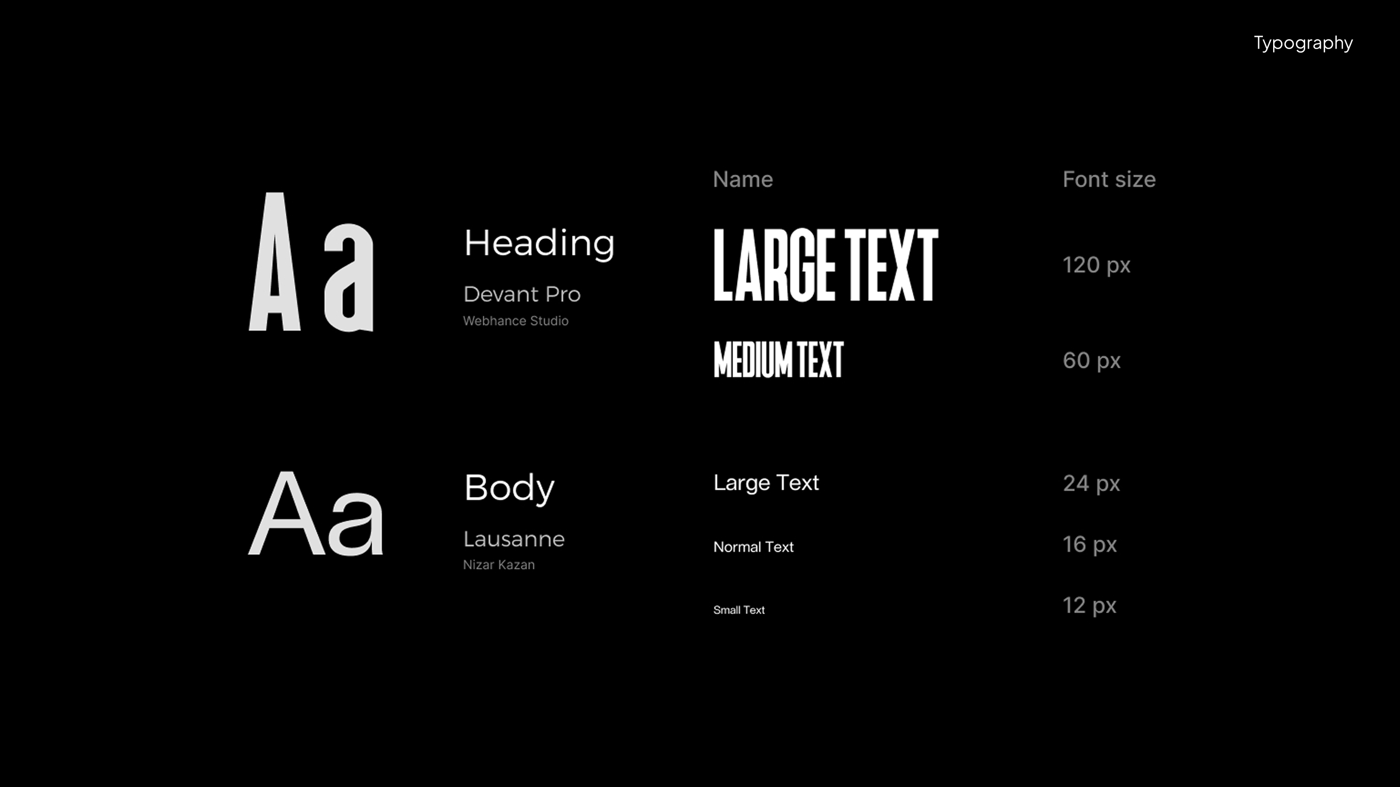
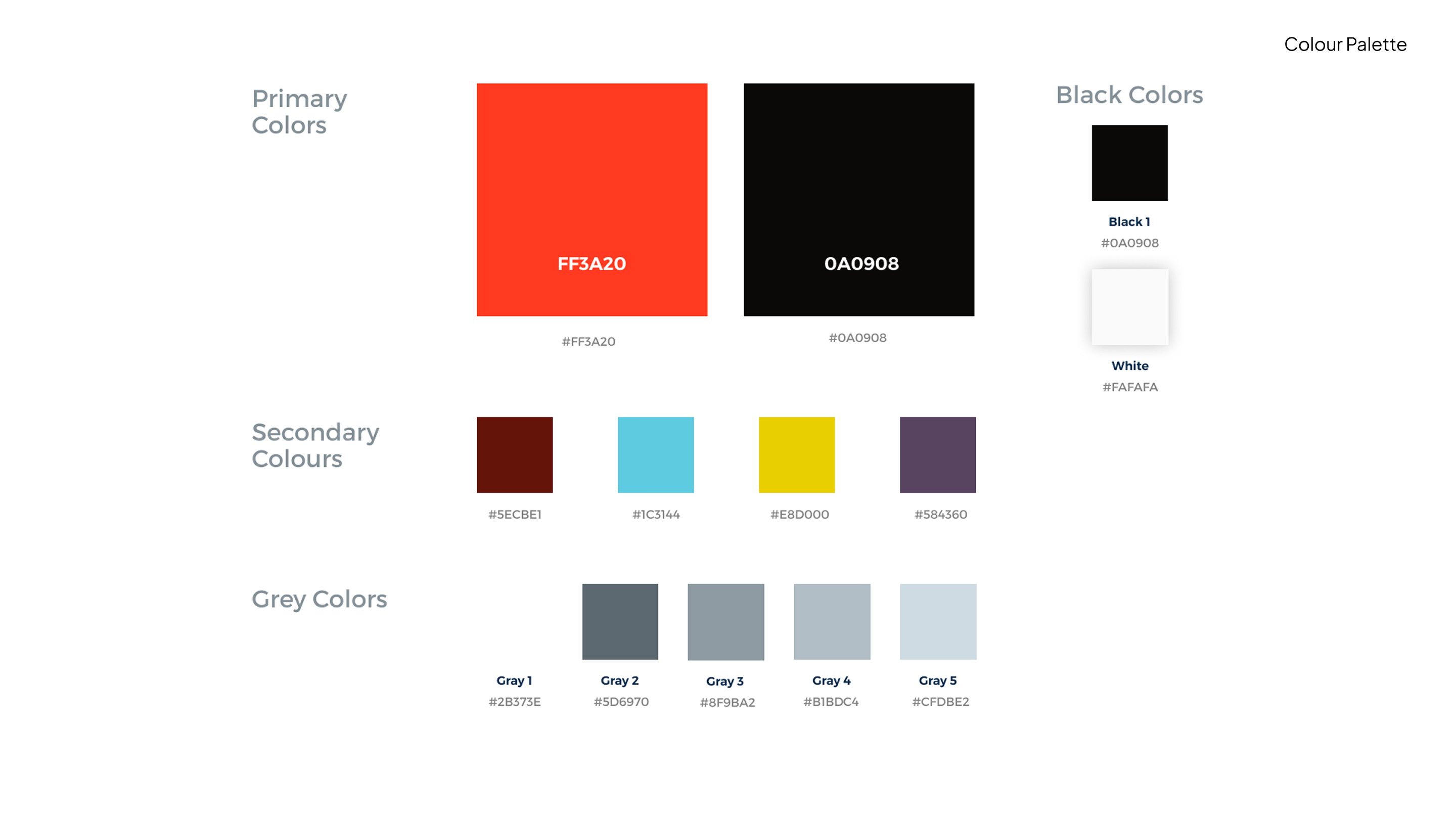
The site lacked a cohesive colour palette, used dated typography, and leaned on a narrow slice of the graffiti world rather than representing the full breadth of its audience. Meanwhile, competitors like MTN Colors and Liquitex were pulling ahead on design quality.
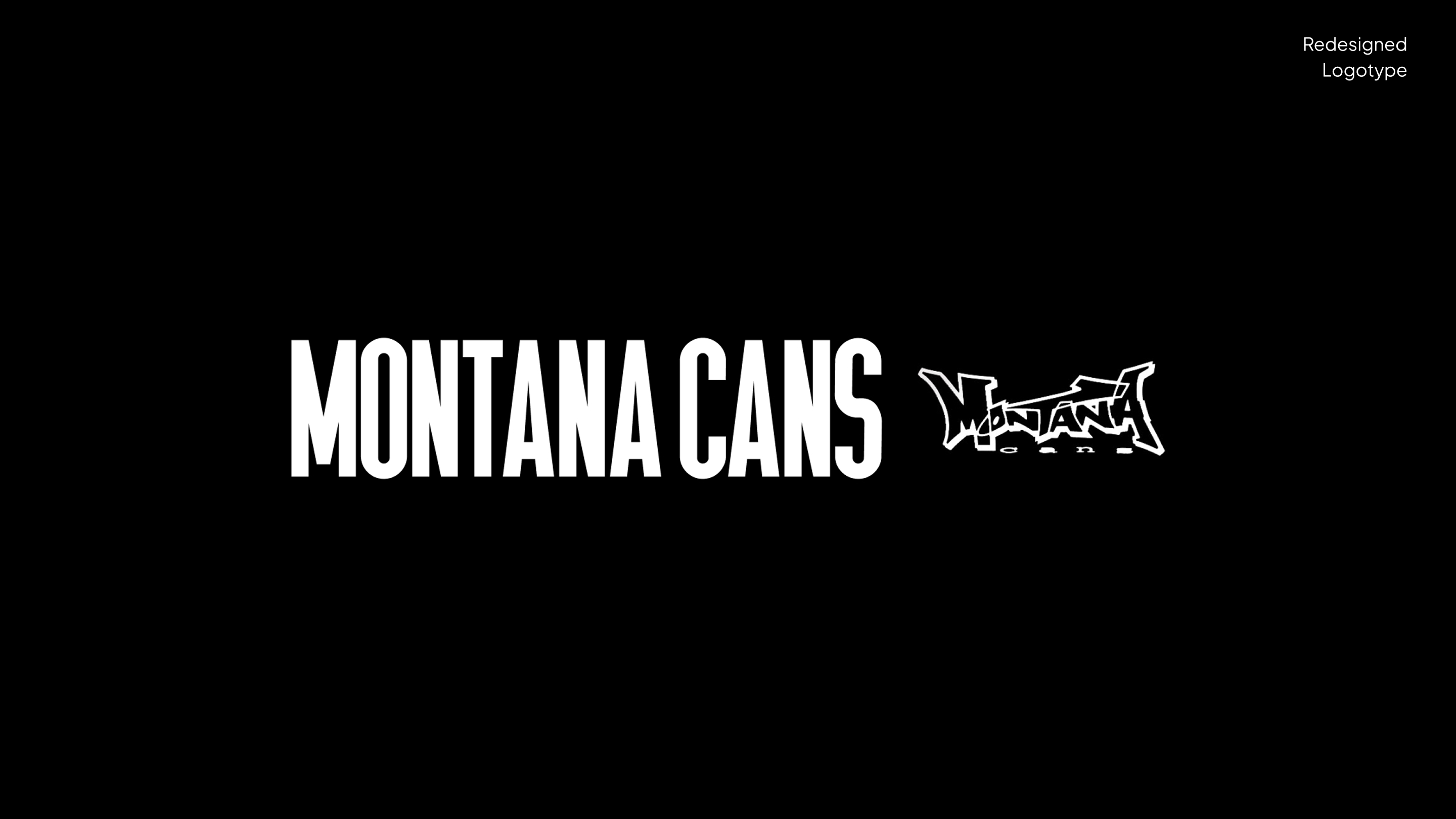
This passion project explores what Montana's brand and web presence could look like with the attention it deserves, recentering the identity around the product itself: the cans. The brand has since updated its site, moving in a direction that echoes several of the decisions made here.
The site lacked a cohesive colour palette, used dated typography, and leaned on a narrow slice of the graffiti world rather than representing the full breadth of its audience. Meanwhile, competitors like MTN Colors and Liquitex were pulling ahead on design quality.
This passion project explores what Montana's brand and web presence could look like with the attention it deserves, recentering the identity around the product itself: the cans. The brand has since updated its site, moving in a direction that echoes several of the decisions made here.
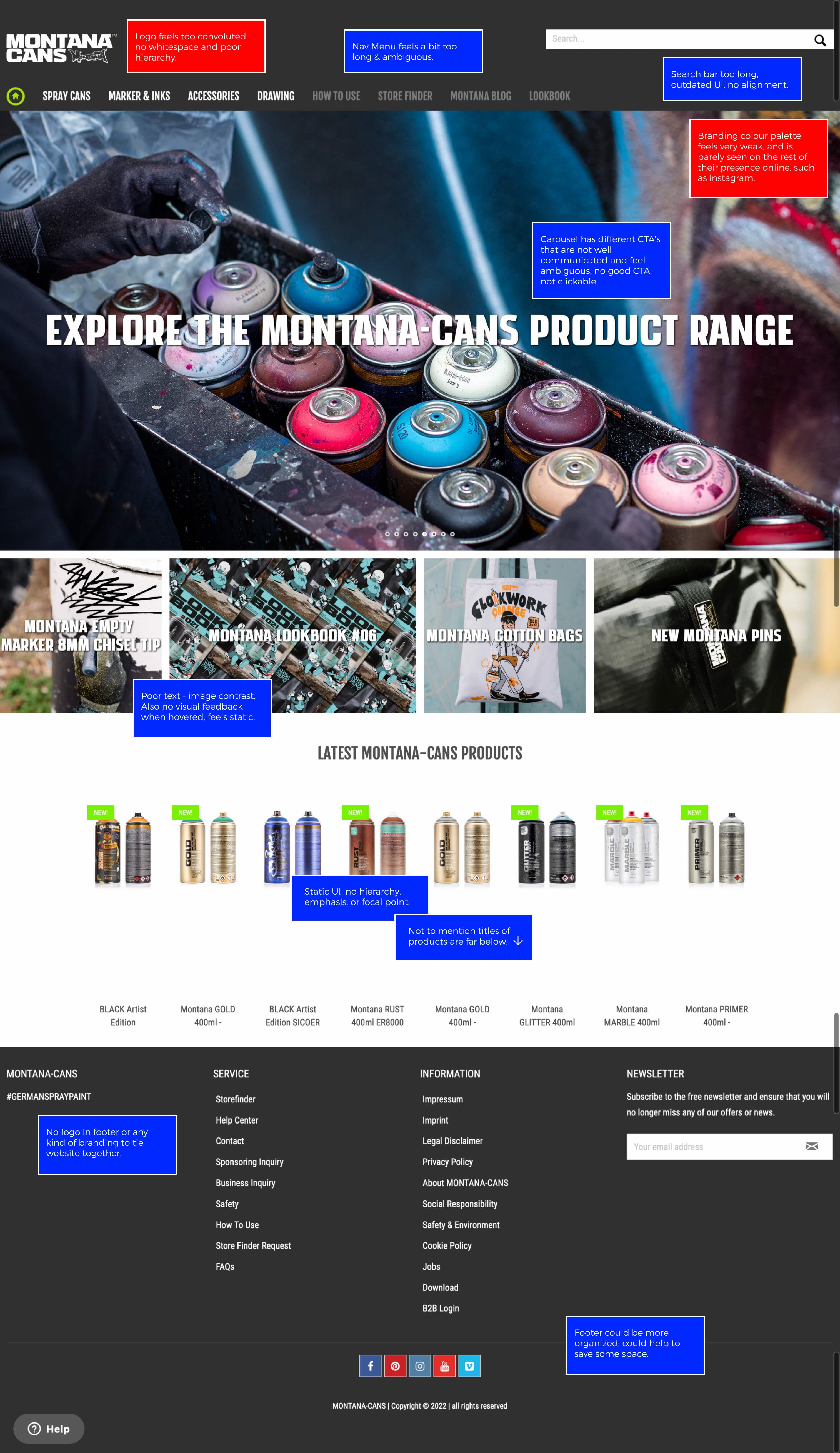
Previous Website Critique:
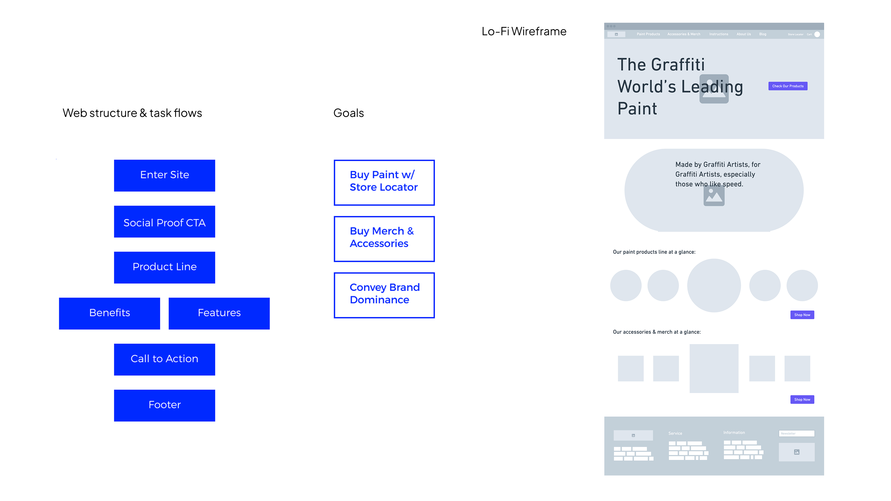
Scroll in the laptop component below to read my critique of Montana's previous website, and what inspired the redesign.
Read my critique of Montana's previous website below, and what inspired the redesign.
Red:
Branding suggestions
Branding suggestions
Blue:
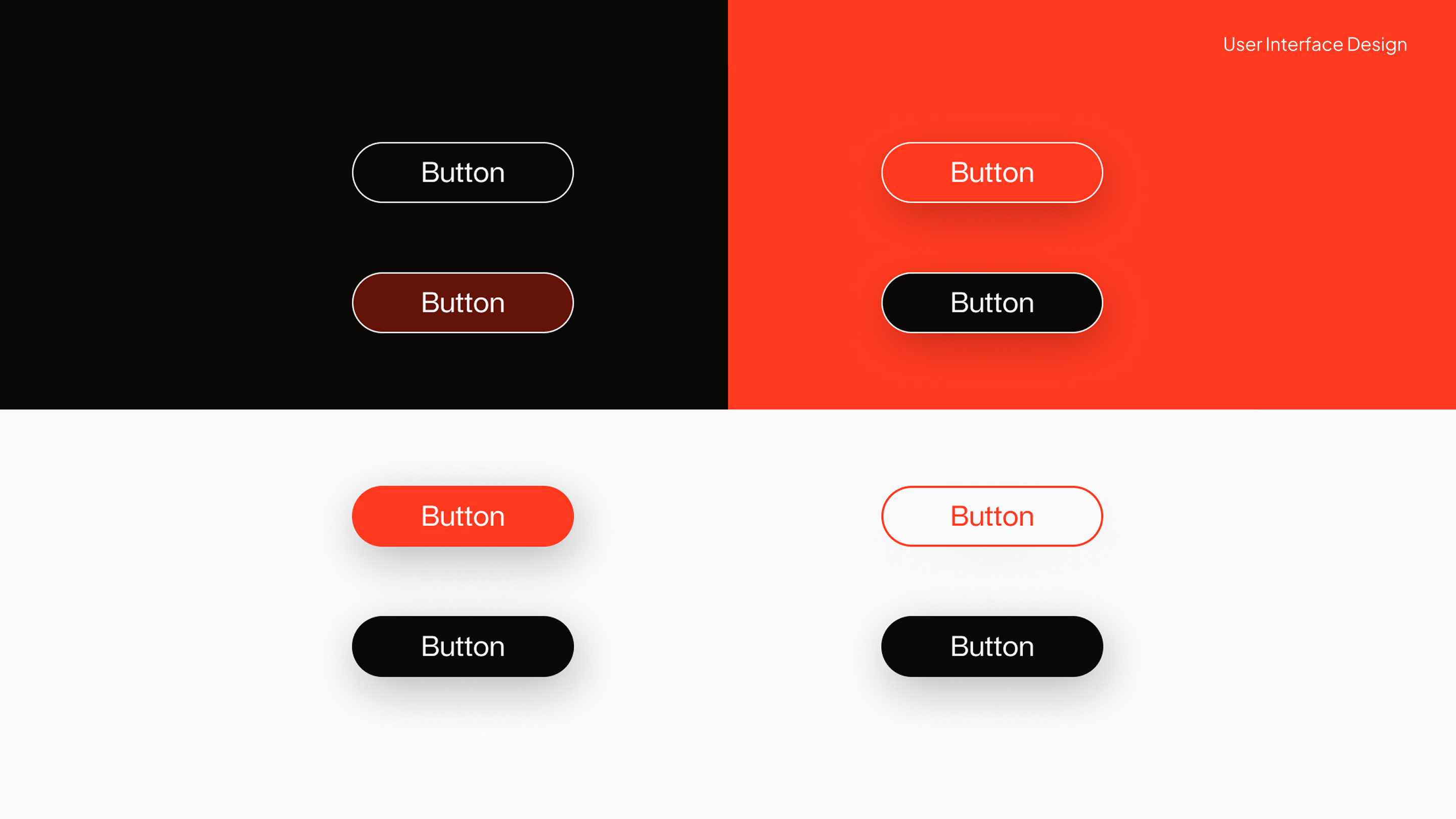
Web design suggestions
Web design suggestions
Scroll

Siino
UX
Librissimi 2023
Graphic Design
%402x.svg)