
Alessandro Marchetti
Librissimi Toronto Italian Book Festival
Print and Event Materials
Client
Librissimi Toronto Italian Book Festival
Service
Digital Illustration, Print
Year
2026
Project Summary
Librissimi Toronto Intalian Book Festival is a non-profit festival celebrating Italian Canadian books, culture, and art, and it holds a personal significance for me as part of the Italian-Canadian community in Toronto.
This is my third year contributing to the festival's identity, following work in 2019 and 2023, and each edition has been a chance to build on a visual language that now feels distinctly its own.
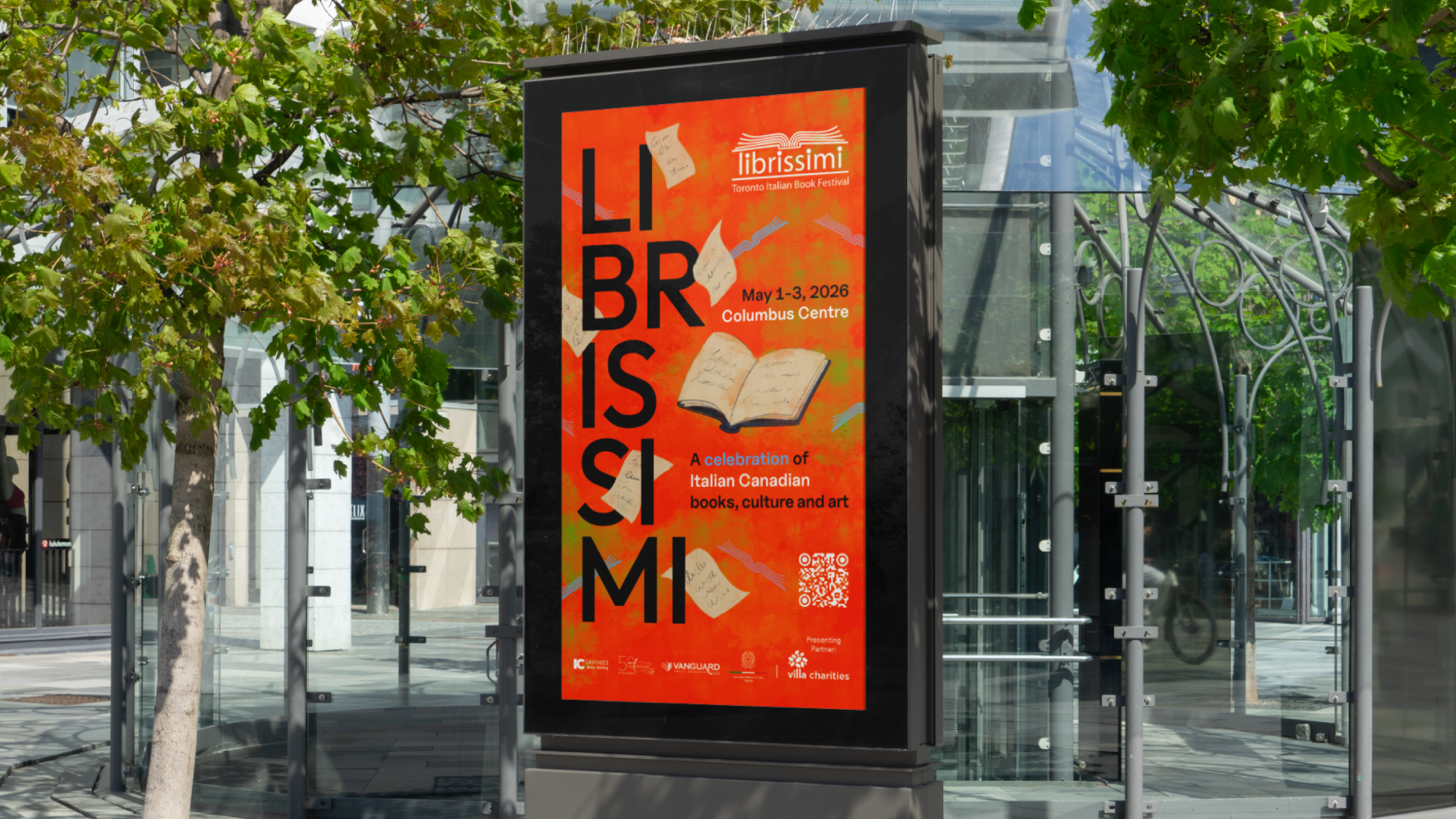
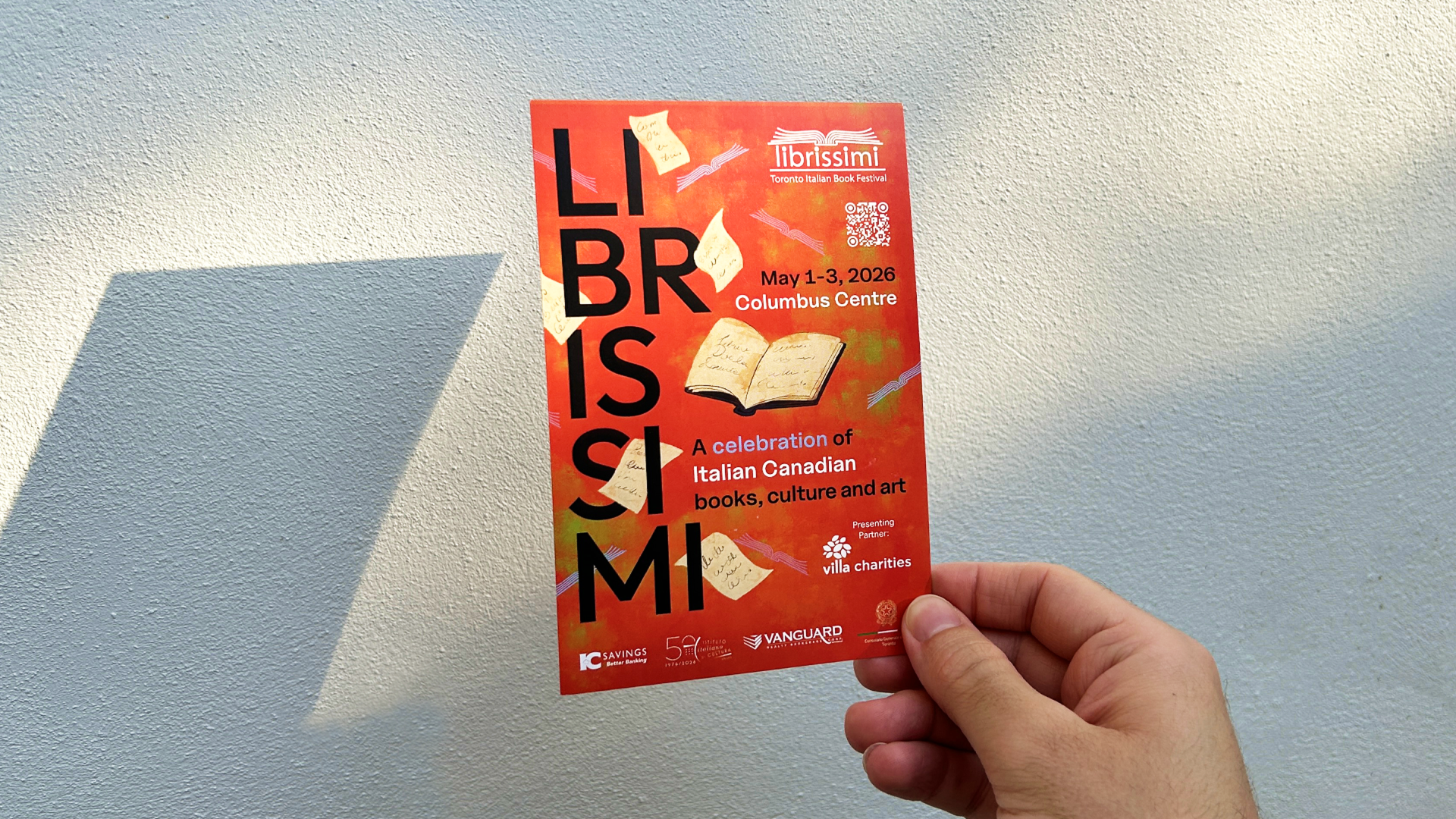
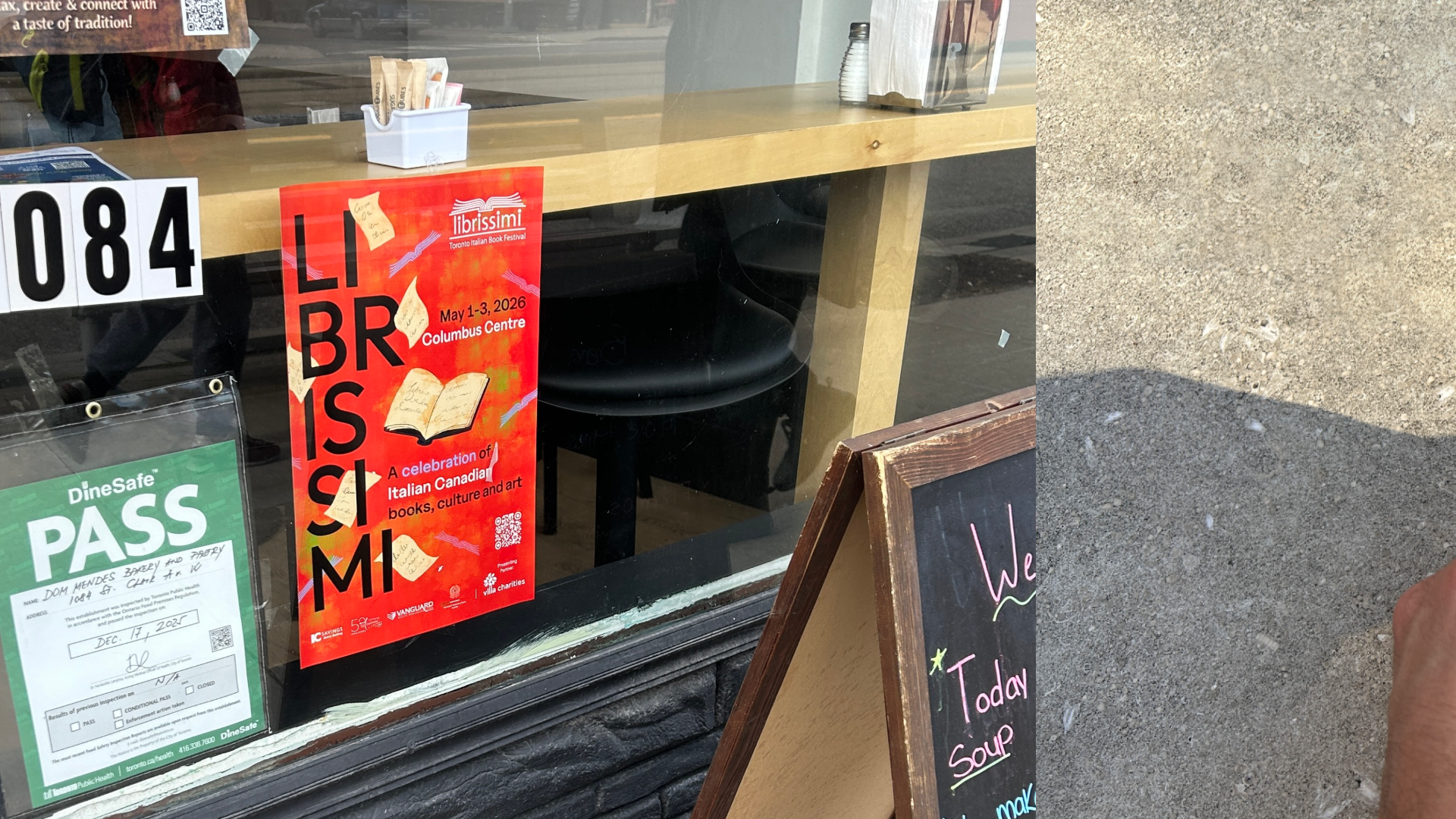
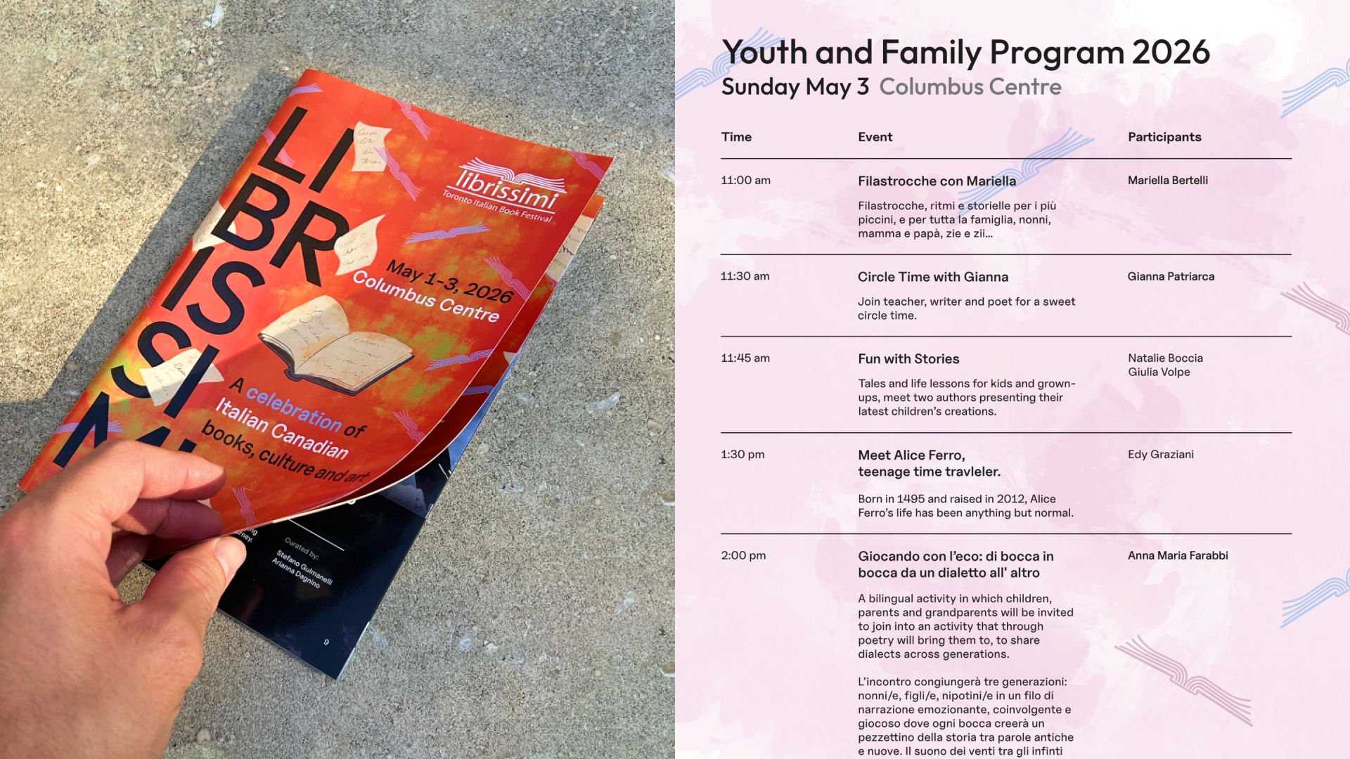
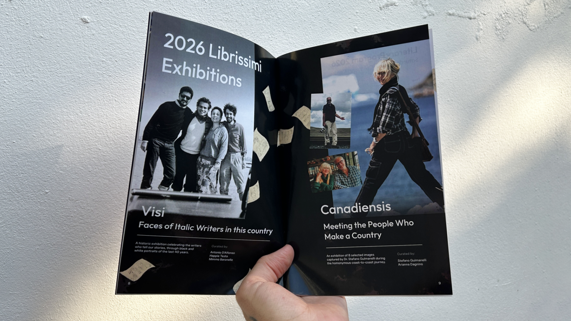
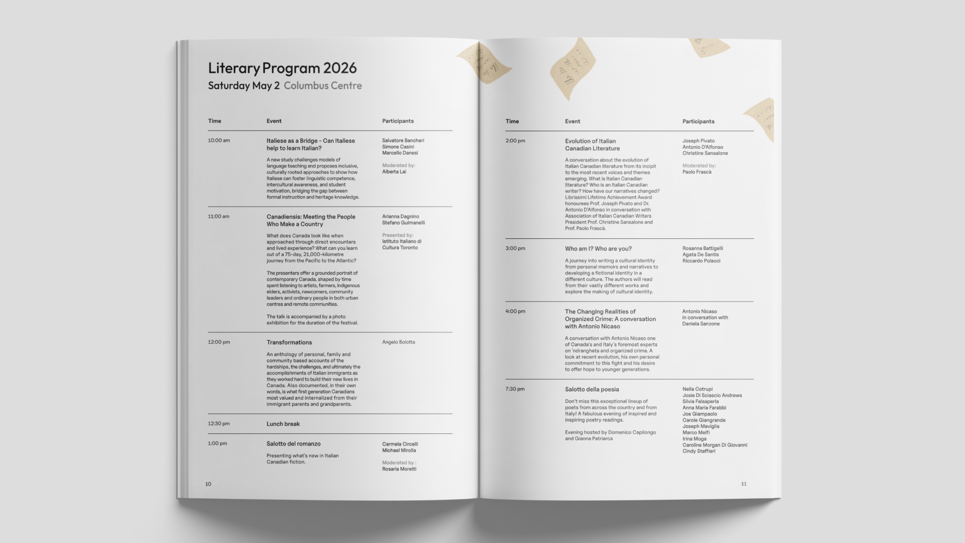
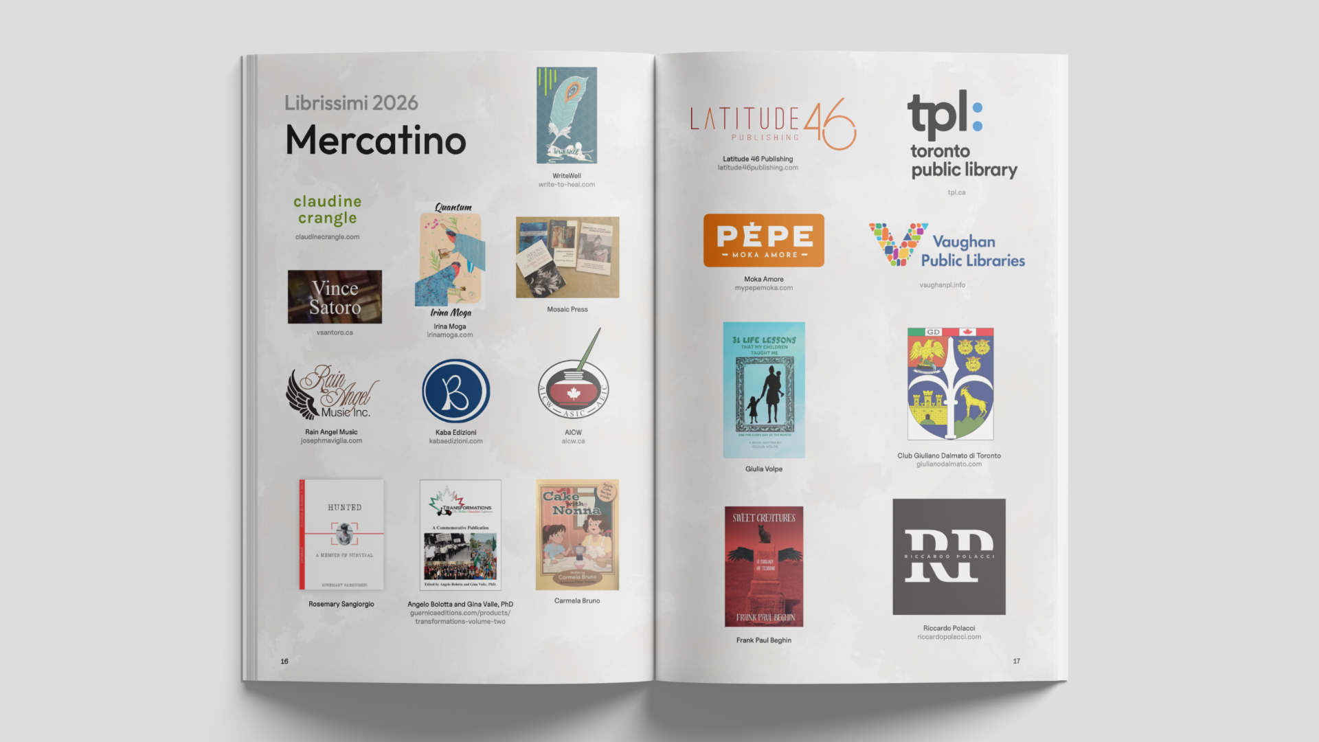
For 2026, I designed a poster, postcard, and a 20 page saddle stitch booklet distributed across the three day event at the Columbus Centre in Toronto. The booklet carries the full program across multiple days, editorial spreads for exhibitions and literary talks, and a dedicated advertiser section, laid out to give every sponsor and vendor clear, consistent recognition.
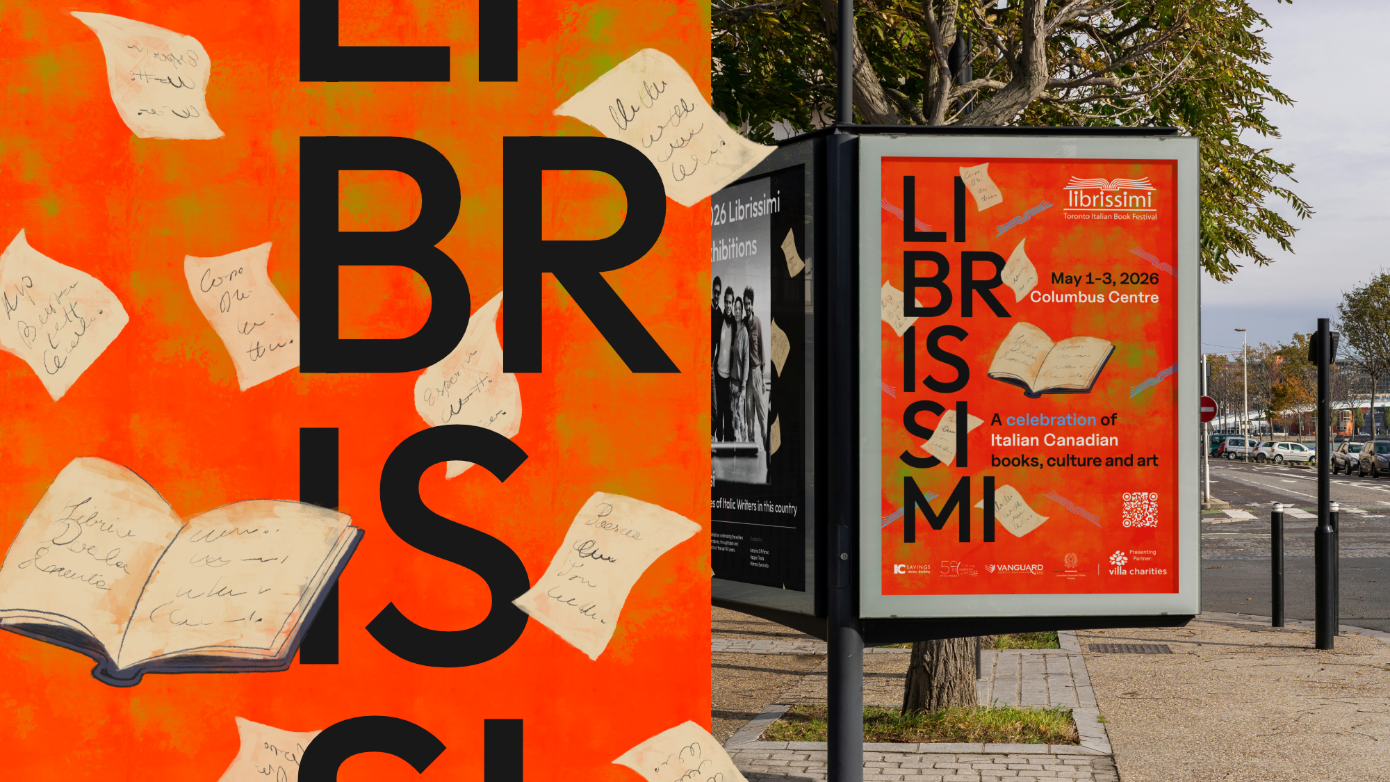
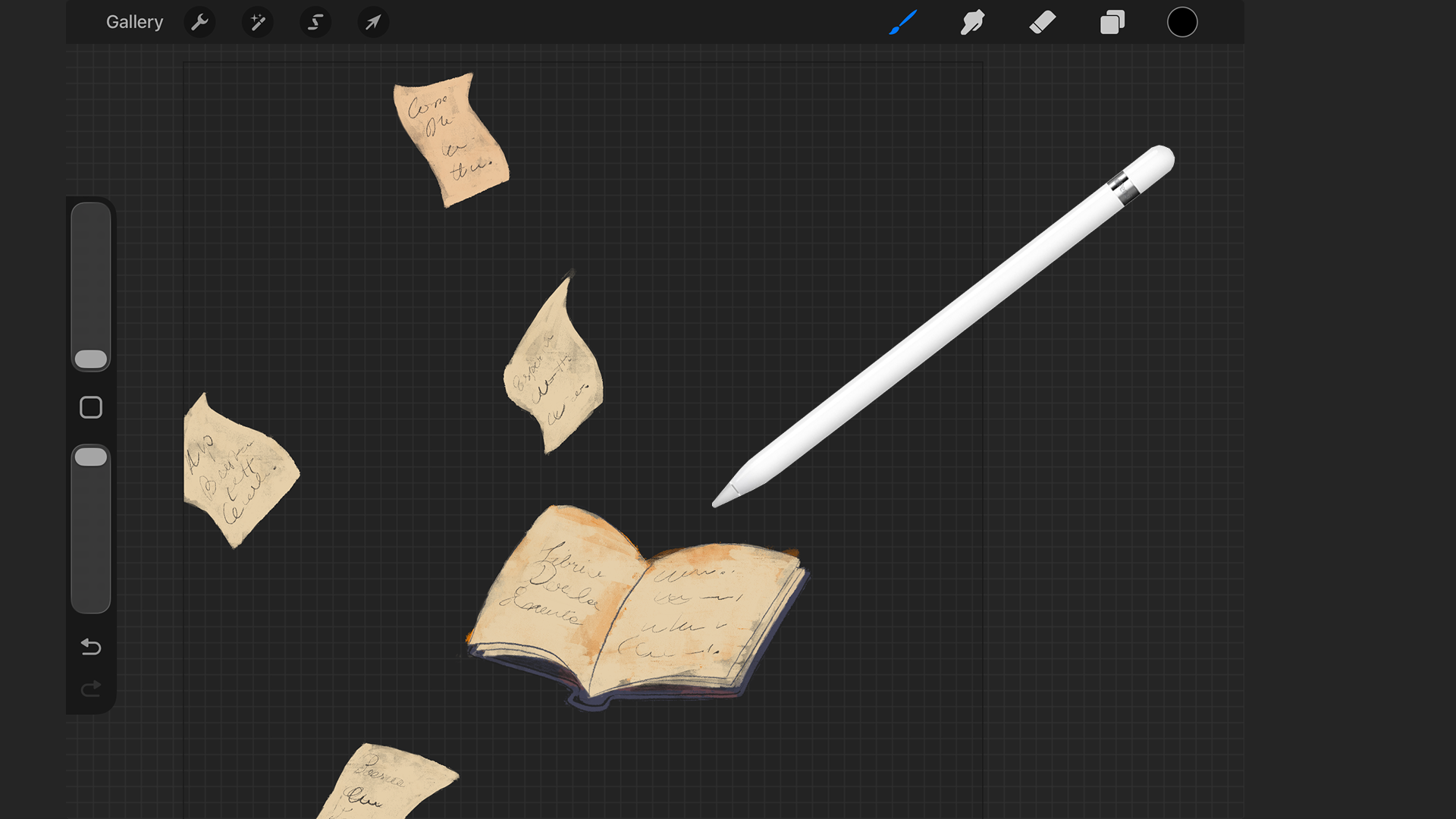
The digital illustration work centers on a hand drawn book with its pages caught mid flight, set against a painted texture I created for this specific edition. The festival's logo also appears as a watermark within that texture, working as a monogram woven into the background
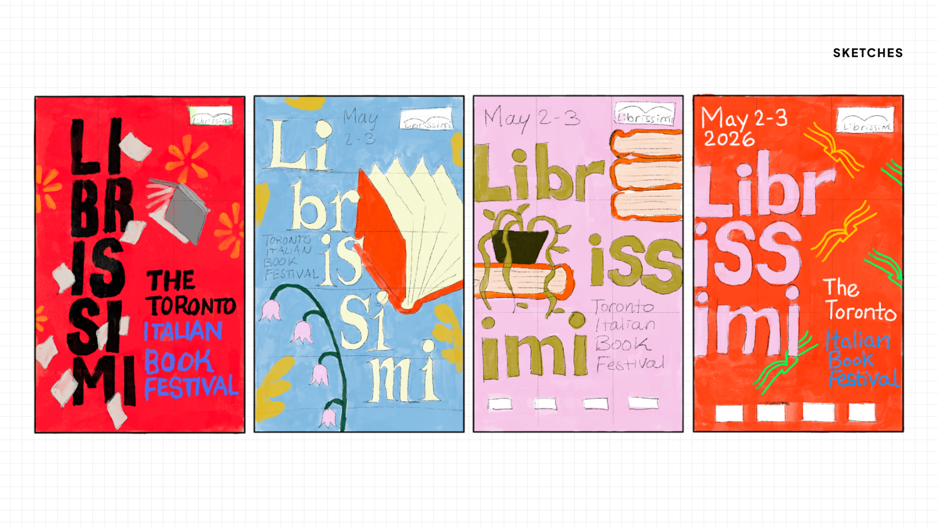
The intent was to balance clean, minimalist typography, closer to the modern European design the festival draws from, against the looser, more expressive illustration. That contrast between structure and motion is what gives this work a classic book cover feeling while keeping it grounded and legible as an event identity.
This is my third year contributing to the festival's identity, following work in 2019 and 2023, and each edition has been a chance to build on a visual language that now feels distinctly its own.
For 2026, I designed a poster, postcard, and a 20 page saddle stitch booklet distributed across the three day event at the Columbus Centre in Toronto. The booklet carries the full program across multiple days, editorial spreads for exhibitions and literary talks, and a dedicated advertiser section, laid out to give every sponsor and vendor clear, consistent recognition.
The digital illustration work centers on a hand drawn book with its pages caught mid flight, set against a painted texture I created for this specific edition. The festival's logo also appears as a watermark within that texture, working as a monogram woven into the background
The intent was to balance clean, minimalist typography, closer to the modern European design the festival draws from, against the looser, more expressive illustration. That contrast between structure and motion is what gives this work a classic book cover feeling while keeping it grounded and legible as an event identity.
NoFlukes: Shoot Your Shot

Brand & Strategy
Graphic Design
Motion
Siino
UX
%402x.svg)